Redesign from Hell: When the Client Wants Everything Changed
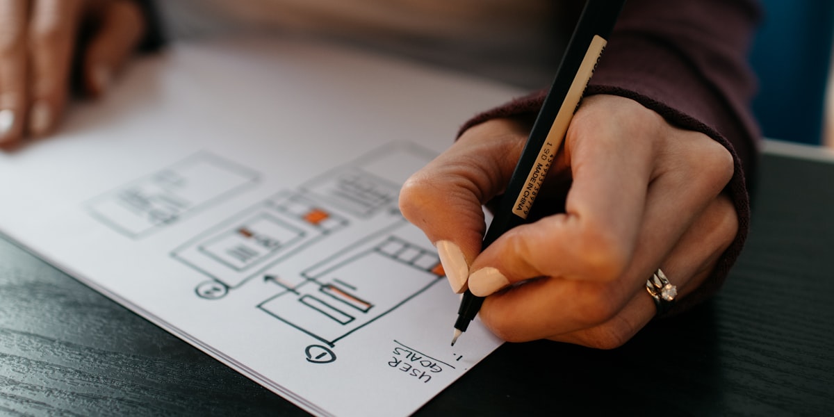
"Redesign" is a word that evokes mixed feelings in our industry. On one hand, it's an opportunity to take a product to the next level. On the other, it's a minefield of subjective opinions, conflicting requirements, and one sentence that haunts our dreams: "Make it more modern."
Over the years, we've been through redesigns that went smoothly. And then redesigns that made us consider a career in forestry. Here are the latter.
"Actually, We Don't Like It"
Classic scenario. Client orders a website redesign. We go through the complete design process -- target audience analysis, wireframes, moodboards, two rounds of mockups. The client signs off on every step. Signs the final design. We start development.
Three weeks of work. Frontend is eighty percent done. Then comes the email:
"We looked at it again and actually we don't like it. At all. Could we start over?"
Let me repeat: they signed off on the final design. Approved the wireframes. Approved the colors. Approved the typography. Approved the layout. But now that they see it "live," they don't like it. Any of it.
What happened? We found out the client had been showing the work-in-progress to colleagues who weren't part of the approval process. And those colleagues had "a few comments." There were thirty-seven comments. In a spreadsheet. Sorted by "priority," with everything marked as "critical."
Redesign by Committee
Twelve people at the approval meeting. Twelve. Marketing, sales, IT, legal, two CEOs, one CEO's assistant (who "has good taste"), and the COO who arrived late, hadn't read the brief, but had the loudest opinions.
Picture this: you're deciding the color of the main button. Green? "Too aggressive." Blue? "That's like the competitor." Orange? "That looks like fast food." Red? "That looks like an error." Gray? "That's boring." Gradient? "That's dated." One button color took forty minutes of discussion.
The result? A compromise nobody was happy with. Because when twelve people agree on a compromise, they produce something that nobody actively wants. It's not that it's bad. It's just... nothing.
The best moment was when the COO said: "I'd do the whole thing differently, but I'll leave it to you." And then spent another twenty minutes explaining how he'd do it differently.
"Make It More Modern"
There's a sentence in the design industry that's the equivalent of "draw the rest of the owl." It's: "Make it more modern."
What does that mean? We can't say. Neither can the client. But they want it more modern. Clear?
We ask for references. Websites they like. Apps they consider modern. Usually we get Apple.com, Airbnb, and "that website I saw last week, I can't find it, but it was kind of... modern."
Based on that, we prepare a design with a clean layout, plenty of white space, modern typography. Feedback: "It's too empty. Where's the information? We need more text there."
We add content. "It's too crowded. It was supposed to be modern."
We're trapped in a loop with no escape, because "modern" in the client's head means something they can't articulate, and we're trying to guess it through telepathy.
Seven Color Schemes in Three Weeks
One project that really tested our patience. Client wanted a corporate website redesign. We started with the brand colors -- logically, brand consistency is fundamental.
Week one: "The brand colors are boring. What about something bolder?" We prepare a new palette. Week two: "That's too bold. Customers won't recognize us." Back to brand colors but with an accent. "I don't like that accent. What about purple?" Purple version. "No, not purple. What about green?" Green version. "Green looks like an eco company. We're not an eco company."
Week three: "You know what, let's go back to the original brand colors." Right where we started. Three weeks, seven color schemes, zero progress.
The lesson we took from this? A limited number of revisions in the contract. Not because we're mean, but because unlimited revisions lead to an unlimited merry-go-round of indecision.
The Teenager as Design Consultant
Meeting with a client about the visual identity of an online store. The client brings his son, a seventeen-year-old high school student. "Jake is into computers, he's got great taste, so I brought him along for consultation."
Jake had taste. Corresponding to a seventeen-year-old kid who spends his time on TikTok and plays Fortnite. He wanted neon colors, animations on every element, dark mode as default (the store sold garden furniture), a custom mouse cursor, and "something like that parallax effect, but more."
And the client agreed. With everything. Because Jake "understands the younger generation" and the target audience of the store is "everyone," after all.
We spent an hour diplomatically explaining why a neon-pink pulsating "BUY NOW" button might not be ideal for an online store selling outdoor grills.
- ✗Approval by a committee of 12 people
- ✗Unlimited revisions with no progress
- ✗Frankenstein design from 5 different websites
- ✗A teenager as design consultant
- ✗Decisions based on feelings instead of data
- ✓Clear design process with milestones and approvals
- ✓Limited number of revisions in the contract
- ✓Decisions based on data and user testing
- ✓One decision-maker with the final say
- ✓Unified visual language across the project
The Frankenstein Design
"Look at this website" -- link to Apple.com. "I want a clean header like this." Then: "And here, that carousel like Amazon has." Next: "Footer like Airbnb." And: "Product page like this beauty brand." Plus: "Checkout like this e-commerce giant."
The client took five different websites, picked one section from each, and wanted them combined into a single design. That's like taking an engine from a Ferrari, the body from a Volkswagen, the interior from a Tesla, wheels from a tractor, and expecting a functioning car.
Each of those websites has its own design system, its own visual logic, its own layout philosophy. Their parts don't combine because they don't speak the same language. A header from Apple.com assumes minimalist content. An Amazon-style carousel assumes maximum information density. Those two philosophies simply don't coexist.
The result of this approach is always visual chaos. A website that doesn't look professional because it lacks a unified visual language.
A redesign doesn't have to be "all or nothing." Instead of a complete rewrite, consider an incremental approach -- gradually improve individual parts based on analytics data and user testing. Smaller changes with measurable impact are safer than a big bang where nobody knows what works and what doesn't.
Why the Design Process Exists
All these stories share one thing: bypassing the design process. And that process exists for a very good reason.
Research at the beginning determines what users actually need. Not what the business owner thinks. Not what his son thinks. What the people who will actually use the website or application need.
Prototyping allows testing ideas cheaply and quickly, before a single line of code is written. A wireframe is easy to throw away. Three weeks of development isn't.
User testing reveals problems that no meeting ever will. Because users don't tell you what they want -- they show it through their behavior.
Iteration means gradual improvement based on data, not based on the COO coming in on Monday with an idea because he saw an interesting ad over the weekend.
Saying "no" (or more precisely, "yes, but let's look at the data") is part of our job. We're not a pixel-producing machine. We're here to make the result work. And sometimes that means defending the design from the client themselves.