App Design Process: From Idea to Wireframes and a Clickable Prototype
Most people picture app development as programming. But the most expensive mistakes don't happen in code. They happen earlier — when a team starts building something nobody really thought through. That's why there's a step between the idea and development: app design.
In this article we'll walk through how design works in practice: from goals and users to wireframes and a clickable prototype that you test with real people and hand over to developers.
What App Design Is
App design is the phase where you decide what the app does, how users move through it and what it looks like. Roughly, it has two parts:
- UX (user experience) — the logic and flow. Which screens exist, what's on them, what happens after a tap, how users reach their goal.
- UI (user interface) — the visual layer. Colors, typography, icons, spacing, components.
The order matters: UX first, then UI. A beautiful screen that users can't get to is useless.
Design is not the same as a technical specification. The specification describes what the software must do — roles, user stories, acceptance criteria, non-functional requirements. We covered how to write one in how to write a technical specification. Design builds on the specification and shows how it will look and behave in your hand.
Step 1: Goals and Users
Every design starts with two questions: what is the app for, and who will use it?
- The goal should be a measurable outcome. Not “a modern booking app”, but “a customer books a slot in under a minute, without a phone call”.
- The users — list the types of people who will use the app. Customer, employee, administrator. Each has different goals and different patience.
For each user type, write down the situation in which they open the app. A receptionist behind a counter with a queue of customers needs a different interface than a manager browsing reports in the evening.
Step 2: User Flow — the User's Journey
A user flow is a diagram showing how a user gets through the app to their goal. It's drawn with arrows and boxes, on paper if you like.
An example for a booking:
- Opens the app
- Picks a service
- Picks a time slot
- Signs in or enters contact details
- Confirms and pays
- Receives a confirmation
This step exposes most of the unnecessary stuff. Does the user really have to register before seeing available slots? Why pick the branch again after choosing a time? Every extra step is a place where some people drop off.
Draw the side paths too: what if someone takes the slot in the meantime, what if the payment fails, what if the user closes the app halfway through. These states are often forgotten in design, and then the developer has to improvise them.
Step 3: Information Architecture
Information architecture is the structure of the app — which sections exist, what belongs in them and what they're called. The output is usually a simple screen map (sitemap) and a decision about the main navigation.
Practical rules:
- Main navigation should have 3–5 items. More won't fit in a mobile tab bar, and users won't remember them.
- Use your users' words, not your company's. An internal “Order module” is “My orders” to a customer.
- The most frequent actions must be the closest. What users do daily doesn't belong three levels deep in a menu.
Step 4: Wireframes
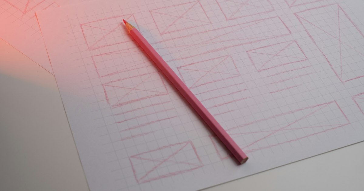
A wireframe is a black-and-white schematic of a screen. A box instead of an image, a line instead of text, a rectangle instead of a button. No colors or fonts — just layout and content.
Why not start with a polished design straight away? Because wireframes keep the conversation on what matters: this information is missing, this button is in the wrong place, this screen is redundant. With a colored mockup, the discussion immediately drifts to the shade of blue.
Wireframes come in two levels:
- Sketches (low-fidelity) — pencil on paper or a whiteboard. Ten variants an hour, and throwing them away costs nothing.
- Digital wireframes — in a tool like Figma, with real copy and a more precise layout. They become the basis for the prototype.
Put real copy into your wireframes, not Lorem ipsum. Only with a real headline, price and description will you see whether the content actually fits on the screen.
Step 5: The Clickable Prototype
A clickable prototype is a set of screens linked so you can click through them like a real app. Nothing is saved, nothing is calculated — but on a phone it looks and behaves almost like the finished product.
It's most often built in Figma. Screens are linked with transitions, the prototype is shared with a link and opens in a browser or in the Figma mobile app. Nobody has to install anything.
The prototype doesn't have to cover the whole app. The main scenarios from step 2 are enough — the ones the app stands on. Depending on when it's made, it takes one of two forms:
- A grey prototype built from wireframes — to test logic and flow.
- A prototype with the final UI — to test the overall impression and to give developers a precise reference.
Step 6: Testing with Five Users
A prototype is worthless until someone who didn't design it tries it. And here's the good news: you don't need dozens of people.
Jakob Nielsen of Nielsen Norman Group showed that five users uncover most usability problems (roughly 85% according to his model). Each additional tester brings fewer and fewer new findings. That's why NN/g recommends several small rounds instead of one big test — five people, fix, five more.
How such a test goes:
- Find five people from your target group. Not colleagues, not family.
- Give them a task, not instructions: “Book a haircut for next Thursday afternoon.”
- Stay quiet and watch. Where do they hesitate, where do they tap something else, where do they ask?
- Ask them to think out loud.
- Write down the problems and sort them by severity.
An hour at a table with five people often reveals things that would otherwise surface in reviews after launch.
Step 7: Handoff to Development
The finished design is handed over to developers. A good handoff includes:
- A link to the prototype and the Figma source file, with access for developers.
- Every screen state — empty, loading, error, success. Not just the happy one.
- Components and styles — buttons, form fields, colors and fonts as reusable elements, not one-off drawings.
- Behavior notes — what happens after a tap, field limits, what gets validated.
- Test results — what changed and why.
It works best when a developer joins before the design is finished. They'll spot what's technically expensive right away and suggest a cheaper path with the same result for the user.
App Design Tools
| Phase | Tool |
|---|---|
| Goals, users, user flow | paper, FigJam, Miro |
| Information architecture | FigJam, Miro, a plain spreadsheet |
| Wireframes | paper, Figma |
| Clickable prototype | Figma |
| Testing | Figma prototype + video call with screen sharing, or in person |
| Handoff | Figma (developer mode), a shared specification document |
The tool isn't the point. A good design on paper beats a bad one in Figma.
What to Prepare Before You Talk to a Developer
You don't need to know how to draw wireframes. But it helps if you bring:
- One sentence about the problem — what the app solves and for whom.
- A list of user types and what they want from the app.
- Three to five main scenarios — what users must be able to do.
- Examples of apps you like or dislike, and specifically why.
- Systems the app should connect to — accounting, payments, e-shop, calendar.
- What won't be in the first version — just as important as what will.
Paper sketches are a bonus. Feel free to just snap a photo of them with your phone.
How Long Design Takes
The length depends on the number of screens, roles and testing rounds. In our MVP plan, wireframes, a clickable prototype and basic visual design take roughly weeks 3 and 4 of the project. For a custom CRM, a clickable prototype of the key screens takes 2–3 weeks. Systems with many roles and complex processes take longer.
We don't quote a flat price for design alone — it depends on scope. If you want to start small, the fastest route is our kickoff workshop from CZK 1,490: in 60 minutes with a developer and a PM we go through your idea, and you leave with an MVP proposal and an estimate. If you then order development, the workshop is credited back.
Common Design Mistakes
- Starting with colors and the logo. Visual style comes after the flow is solved.
- Designing only the happy path. Error and empty states then get invented by a developer without context.
- Skipping testing because “it's obvious”. It's obvious to you because you designed it.
- Testing on colleagues and family. They'll tell you it looks nice.
- Prototyping the whole app at once. The main scenarios are enough; the rest is refined iteratively.
- Handing developers images instead of a prototype. A static image doesn't show behavior.
We've listed specific design mistakes in mobile apps — from ignoring platform conventions to missing offline mode — in 5 common mistakes in mobile app design. And if you want to see what happens when design ignores users entirely, take a look at our gallery of UX horrors.
Summary
- Start with the goal and the users, not screens.
- Draw the user flow, including side paths and errors.
- Settle the structure and navigation.
- Wireframes on paper first, then digital.
- Link the main scenarios into a clickable prototype.
- Test with five users, fix, repeat.
- Hand development the prototype, states, components and notes.
Design is the cheapest place to change an app. Every hour spent on a prototype saves days in development. You can read more about how we approach design on our UX/UI design page.
Want to know what your app would cost? Calculate it with our configurator, or book a kickoff workshop — we'll go through your idea and suggest what to build first.